Updating modern architecture with color
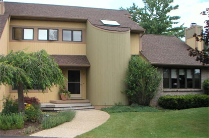
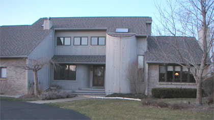
Many attractive homes have been built in the past twenty years. Their visual problem lies in the under usage of color to make them exciting. This suburban Detroit area home has an interesting façade but the brick, the trim and the front pavilion are all lost in a monochromatic color scheme.
Taupe Towns
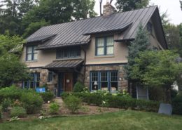
Much of modern suburban architecture in the last 30 years has been painted with a monochromatic palette. Taupe is a safe color, according to builders. It’a also boring and it hides any architectural detailing. So much of the new housing stock is painted taupe today they they have coined a new phrase – Taupe Towns.
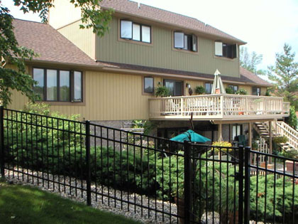
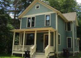
One easy to fix a taupe house is to just add some interesting colors. For example, the rear of this house is divided into two color zones allowing it to feel less vertical. The decking is tied into the first floor with the use of a similar color. The overall effect now works well with the fine landscaping creating a warm inviting environment.
Goal & Solution
Goal
The owner wanted to enliven the house and gain “street appeal.”
Solution
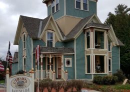
Employing paints to specifically emphasize the trim and the front tower, this color scheme also allows the brickwork and the roof to be more visible.

