Owner’s comments:
“What more can I say….’I LOVE IT! So, so many complements” It is just perfect! We are very pleased and hope we don’t freak out the painter when we hand him the color maps.
Color placement maps are your final product, they supply specific instructions to your painter about specifically what colors go were on the various house facades and architectural details. These maps can save you money as they will render unnecessary the need for any “change orders” to the painter which is usually an extra cost item.
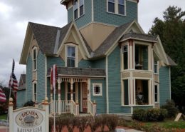
Salt Lake City Victorian
Any house that is primarily masonry offers a special challenge. All the colors employed on the trim need to work perfectly with the brick color. The testing instructions I’ve developed allowed the homeowners to view the various color options against the brick in a variety of light conditions so that they could select just right ones. Out buildings colored in appropriate colors can add a great deal of the visual appeal of your property. This example employed the trim colors of the house with red body color to emulate the brick of the main house. Out building color assistance is available for a slight extra charge when you sign up to be a client.
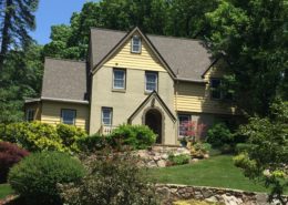
Goal & Solution
Goal
The keywords for this color scheme were to be “timeless and elegant with a touch of whimsy.”
Solution
Every color employed here is from the period the house was built, circa 1885. Event the playhouse and garage now have period colors that enhance their visual interest.