Owner’s comments:
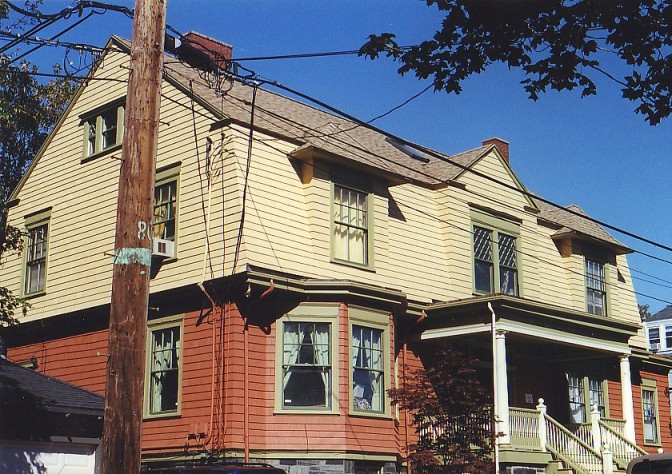
Sommerville, Massachusetts now has a new Landmark. “A passing policeman, speaking to our contractor’s project manager called the renovation of the house ‘a glorious transformation,’ I think that sums up very well Glenn’s and my feelings as well as those of the community around us.” Carol Freeman. The colors were drawn from a late Victorian paint brochure. The combination was recommended by the paint company for this specific style of building. Those period colors were matched to a modern, locally available paint.
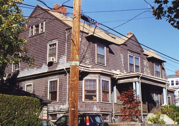
Sometimes the simple brown house is not the best answer
This bland monochrometic color choice does nothing to highlight the lovely Victorian architecture. This type of paint scheme is more appropriate on modern sub-division homes of the 1990s. Homes that have clear divisions between the floors should have two colors on the body. The new color scheme shows that clearly.
Goal & Solution
Goal
The owners thought the house was probably painted the dark brown in the 1970s. They wanted an updated set of colors the were more lively.
Solution
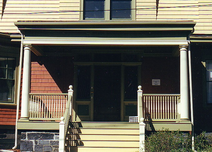
The new color scheme divided the house into logical haves with a period yellow top and a terra cotta bottom. A dark green trim with off-white accent brought this former graceful home back to life.

