Modern architecture – it’s not the details
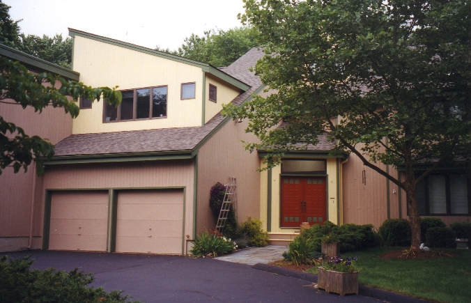
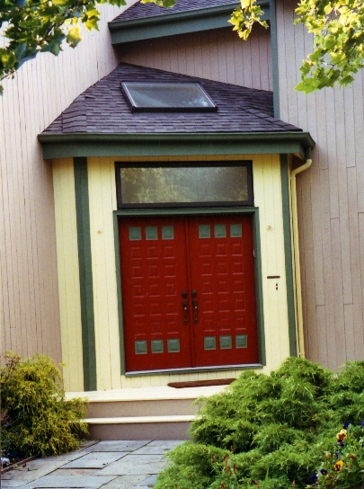
When designing color schemes for modern homes I tend to focus less on the details and more on using what the architecture gives you. With this house, it was the trim and various “block” areas that make up the facades. The once forgotten trim is now highlighted with a contrasting green. The house now sports eye catching entryway and has a great deal of curb appeal according to the owner.
Safe and uninspiring
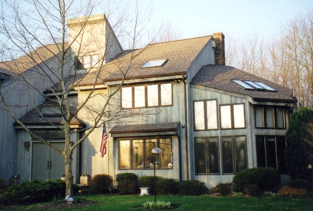
A problem with most contemporary architecture is the outright drabness of a monochromatic color scheme. Unlike the Victorians who used color to visually enhance their house’s architectural elements, owners today generally choose a single neutral color. Taupe or gray are safe and uninspiring. This owner wanted to change the look from the “big, bland, box” to something with style.
Goal & Solution
Goal
This owner wanted to change the look from the “big, bland, box” to something with style.
Solution
Taking a cue from Mondrian and the Austrian Secessionest School architects, this new scheme adds large areas or blocks of color.

