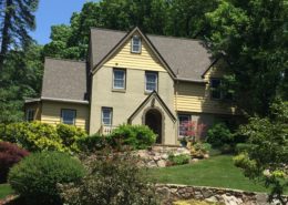
Craftsman home in Grand Rapids, Michigan
We’re thrilled with the colors. One of the things we’re most pleased with is the color and warmth to the exterior. Before the paint job the house looked cold and austere. Now there’s a liveliness and warmth to the whole look of the house. We were also very happy to see how well the colors tie together the disparate elements of the exterior. There were a lot of things on the house color-wise that were not going to change — for instance the green tile roof, red brick, and weathered copper gutters. Rob did an excellent job of selecting just the right color scheme to bring everything together. And there’s no way it would have turned out as well as it did if we had tried to do it ourselves. We knew we wanted colors that would be appropriate for the architecture and time period of the house, but we just didn’t know where to begin. If we had simply sifted through stacks of paint chips and reams of color swatches, I have no doubt we would have ended up with something bad — either garish or boring. Really, it’s hard to explain why exactly the colors work as well as they do, but as one of our neighbors put it, Rob “got it right.” Sarina and Jonathan Moore
As seen in the February/March 2009 issue of Cottages & Bungalows magazine
Inspiration from 1905
This Foursquare Craftsman style home in Grand Rapids, Michigan is a good example of how adding the right amounts of color, as accents, can visually enliven a larger house. This color addition should be undertaken without distracting or over emphasizing the homes essentially handsome details. Built in 1905 the house sits prominently in the Heritage Hill historic district. The colors were chosen from a Lowes Brothers paint color card published in 1905 and matched to a modern paint fan deck.
Goal & Solution
Goal
The owners wanted an historical color scheme that would be fitting for the surrounding neighborhood of grand residences.
Solution
The house stucco was painted white with a slightly off-white trim and a dark green accent color that contrasted too much with the warm Craftsman red bricks of the first floor. This made the house look like it had been cut horizontally into three slices: the green tile roof, the white second floor and the lower brick section. Since the brick color, a perfect period example, was not going to change and the roof tiles were still in great shape, that left only the second story to unify the architectural elements of the house. The upper story had to be distinctive, yet work to tie the floors above and below into the overall color scheme. A period medium tan was chosen for the stucco. The window trim was highlighted with a green/gold dark hue that emphasized the new sash color, a warm red/brown. The trim color was also carried to the English style roof dormer replacing the dark green with something less bold. An Arts & Crafts period off-white was painted on the porch columns.