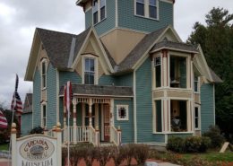
This lovely Victorian home was lost in a sea of soft colors with little or no contrast between them on the architectural elements. It was a pleasant looking home but lacked “street presence.” The owners wanted an updated color scheme to more correctly reflect the historical colors of the late 19th century. The current slate roof was a major color factor to be considered. The owners also requested color assistance with replacement of the metal porch roofs.
“Thanks for all of your expert guidance in turning our home into a real show place that the entire community now enjoy. We certainly love it…came out better than we ever could have imagined.”
Ken & Mary Barnett
The mix of a period yellow and olive produce just enough contrast to allow the tower and the gables to be offset from the body visually without seeming to jump out at the viewer. Working with large Victorian era homes requires striking a balance between colors, siding types and details.
“We can’t begin to tell you how happy we are with the finished product. To say we had a hundred people stop in our yard and admire it would be an understatement. In fact, the local paper (Caroline Progress) and the Richmond-Times Dispatch newspapers are doing articles on the home and the color scheme.”
Ken & Mary Barnett
Accenting a Victorian Home
The front entry porch is a complex design that called for extra care in selecting the trim and accents colors as well as their placement. All were chosen from historic period paint brochures and applied according to color rules in effect at the end of the 19th century. The entry requires a welcoming look without too much fussy detail.
“Our community has enjoyed the process and our painters have become quite famous here. They really did a wonderful job and it was quite a labor of love. Mr.Burke and Mr. Dickerson (our painters) mostly paint historical houses and they are very proud of this one for sure.” Ken & Mary
Goal & Solution
Goal
A simple goal here – to enliven a house that already had a large amount to architectural detail that was hidden by a color scheme that was too soft for the architecture.
Solution
A two-toned late nineteenth century body combination was employed, along with a dark trim to set off both the horizontal and vertical wood trim. Both light and dark accent colors were employed to help the many architectural details become more visual.