As seen in Cottages & Bungalows magazine November 2009
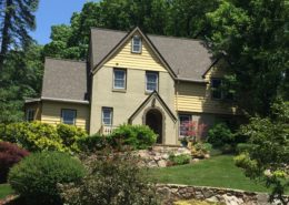
This lovely Arts & Crafts era home lacked any curb appeal. Located in a Birmingham, Alabama historic neighborhood, the owners wanted earth toned colors but beyond that they admitted confusion on how to handle all the stonework. Too often people want to match the stone work instead of letting the stone be just one part of an overall color design.
No color element stands on its own.
Every color visible on the house must be considered when developing a good solid color set. The overall effect of the final paint scheme was one where the masonry elements were allowed to stand alone and not blend in or be overpowered by the wood paint colors. Harmony in color schemes with both masonry and wood surfaces is complex but the outcome can be stunning.
Goal & Solution
Goal
The owners wanted an updated paint scheme that would provide a visual experience appropriate to the homes history and architectural features. They desired earth toned colors but beyond that they admitted confusion on how to handle all the stonework.
Solution
Making the new colors work with the masonry while not overpowering it was the key goal of this project. Historic period earth tones drawn from an old Sherwin Williams paint brochure circa 1910 provided the colors. A deep period red/brown was chosen for the clapboards and softened grayed yellow for the upper shingle sections. The medium brown trim ties all the colors together.